Design System and Component Library
OVERVIEW
As Frontier was emerging from bankruptcy they conducted a full brand reinvention alongside a technology stack update. The site’s visual language needed to be reworked, and its core components had to be rebuilt and documented to create a design system and component library.
Client
Frontier
Scope
Create a comprehensive design system and component library in Figma, then connects to Figma Make, and developed in the new stack. It will include all text styles and components used in a website, it will be accessible, responsive, flexible, and scalable by using Atomic Design methodology.
Results
Migrating the website to a new stack gave the opportunity to create better constructed components, and connecting the design system and component library to Figma Make made it accessible and consistent for all designers and developers.
PROBLEM
Needed a universal digital design system and component library
A universal digital design system or component library does not currently exist, which has led to an inconsistent website and brand image.
1
Inconsistent brand image confuses customers and destroys trust.
2
Website felt old and outdated.
3
Needed the ability to quickly build and launch new webpages as needed.
Current site evaluation
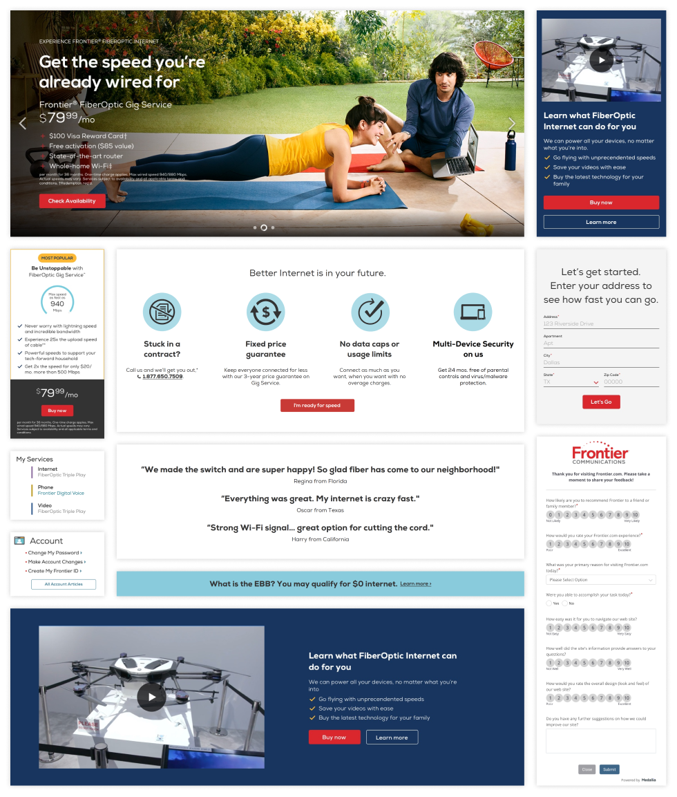
All components were analyzed to determine which ones needed updates, which can be combined into the same component, and which ones can be removed. These are some examples of old components that needed to be updated for use in the new component library, they include:
Hero, Media & text card, Product card, Icon & text grouping, Forms, Quicklinks, Testimonials, Surveys, Banners
THE APPROACH
Test and rebuild
Define the foundations of the design system, then build and refine components through continuous testing and iteration to ensure consistent, reusable patterns across all digital products.
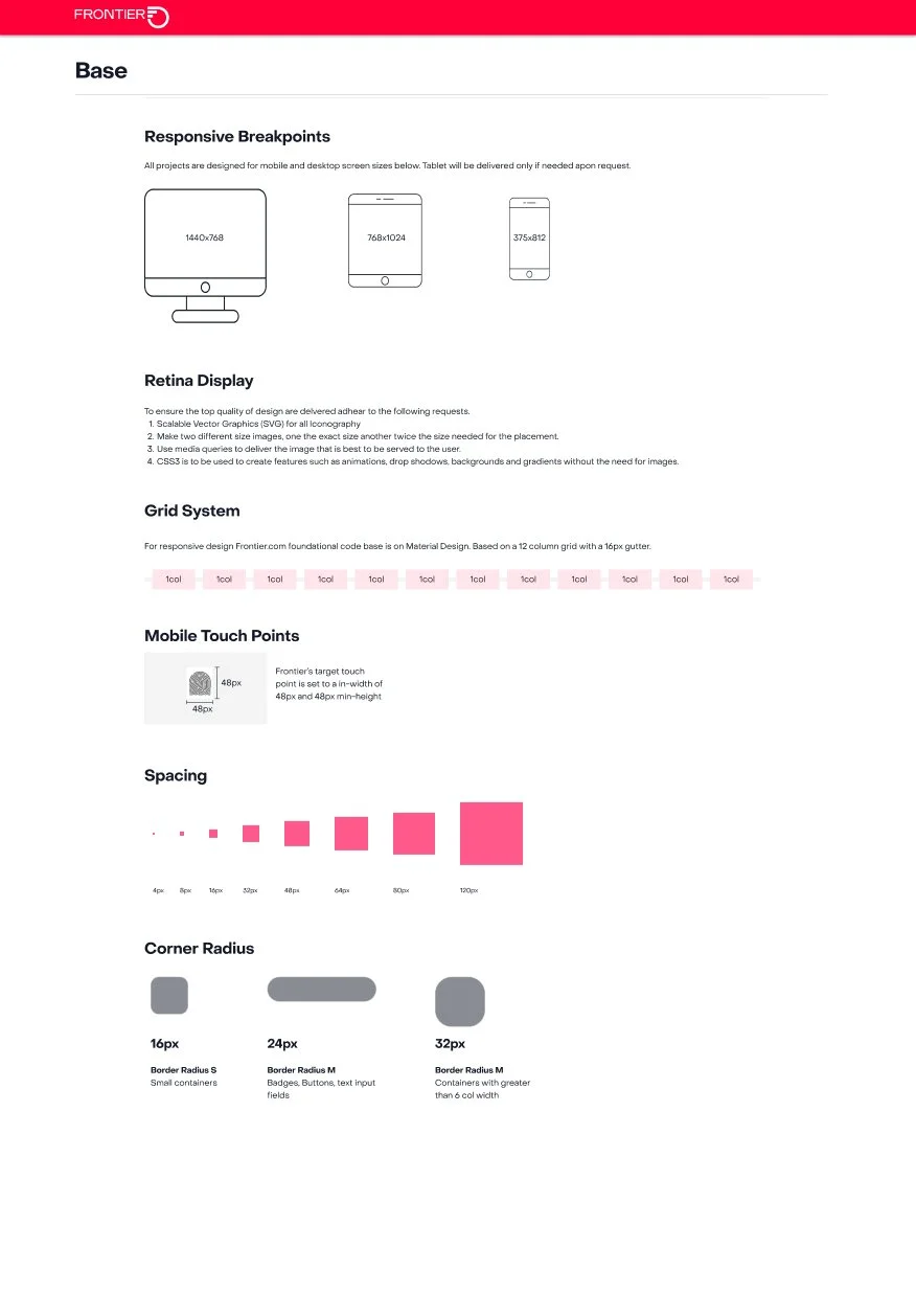
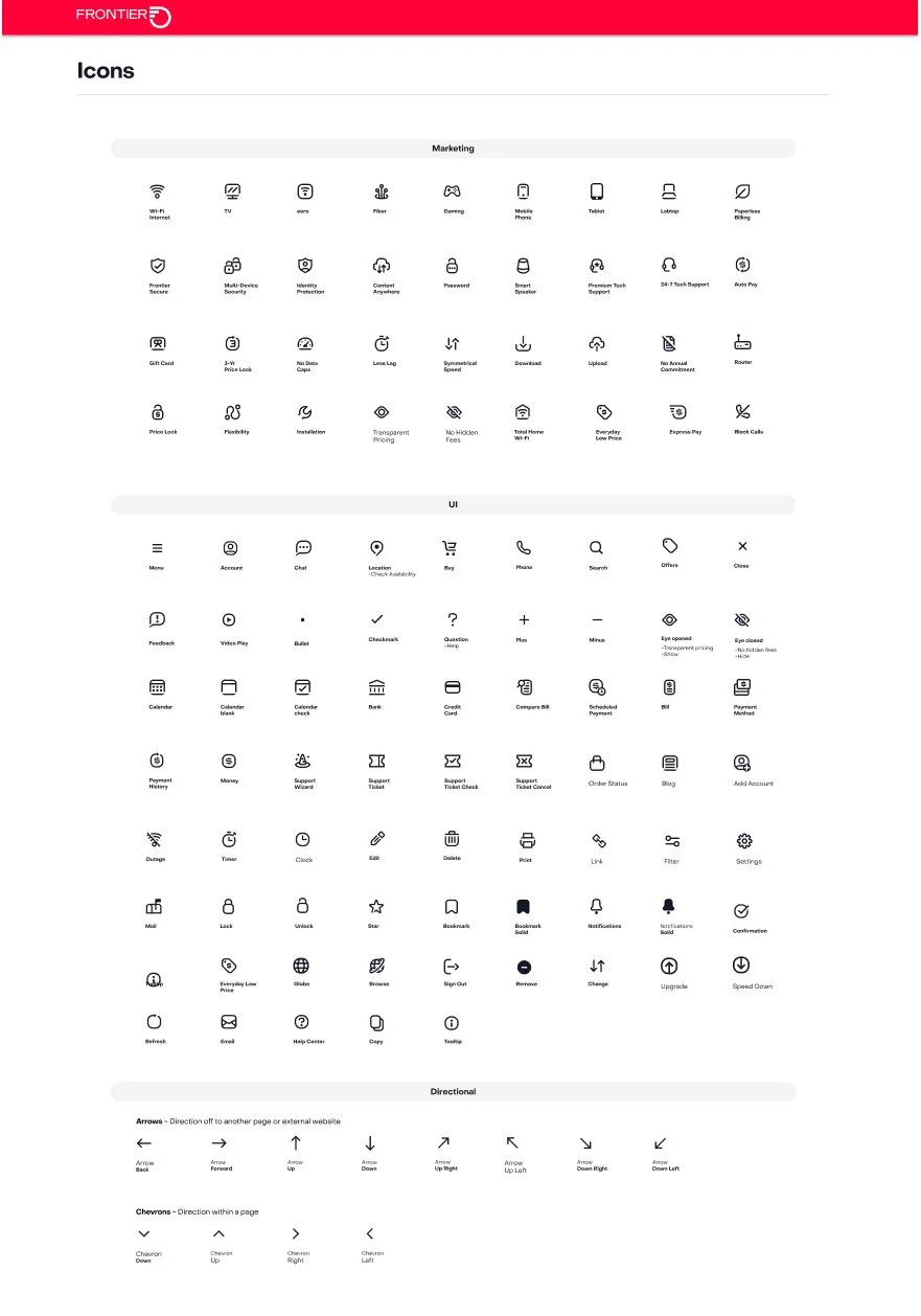
Design system Foundations “atoms”
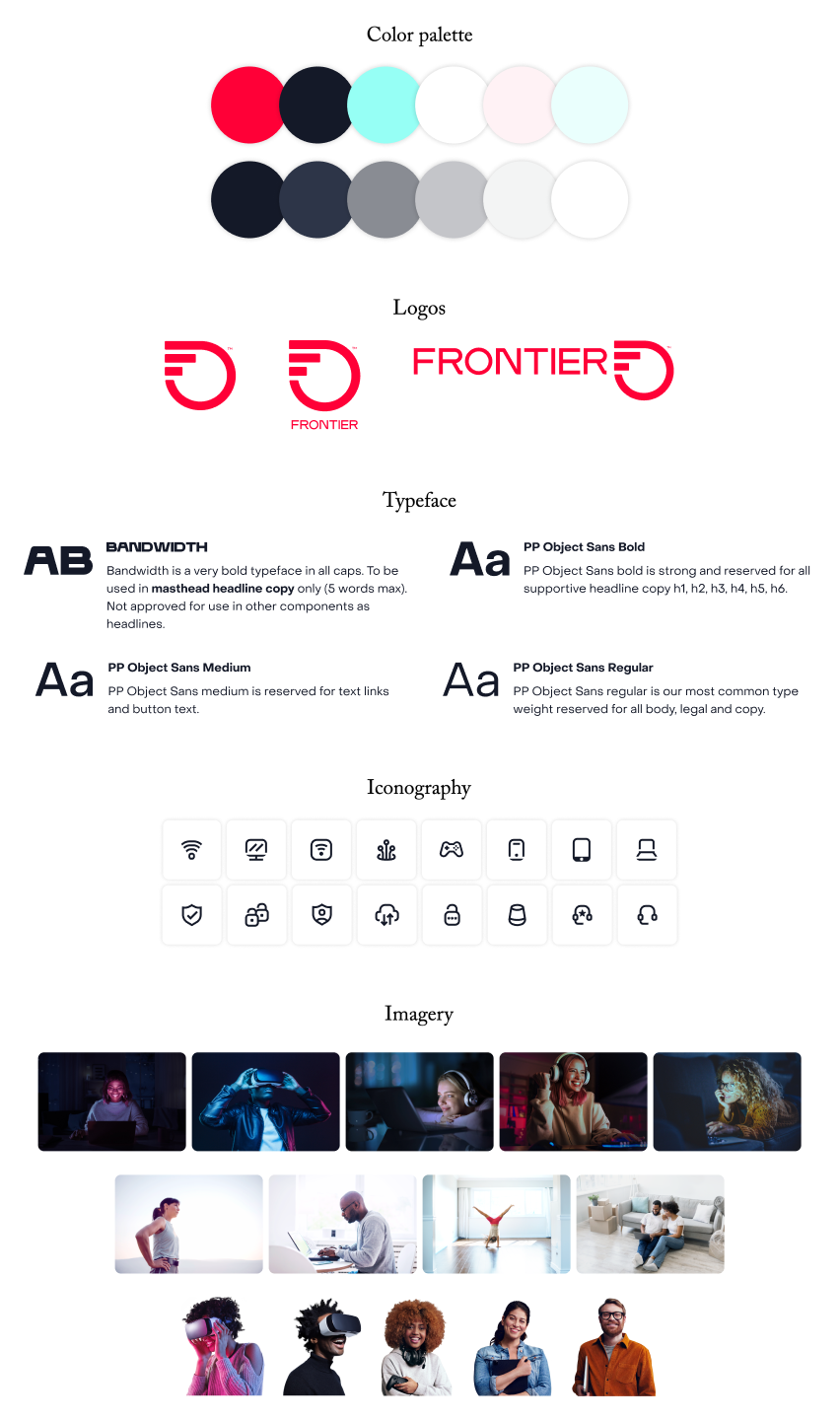
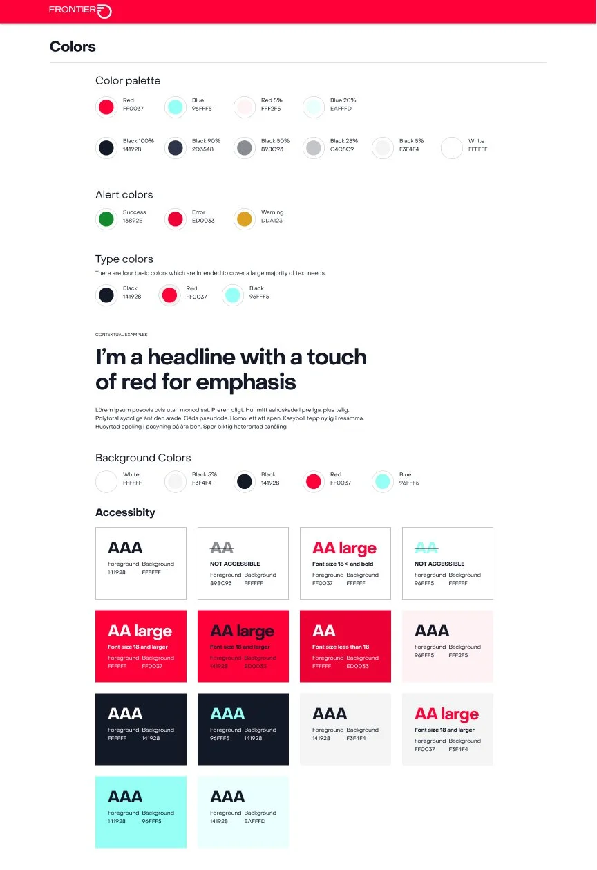
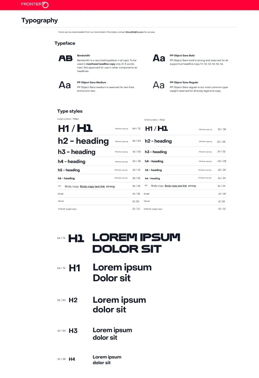
Working with outside agencies during the rebrand, we were given a new color palette, logos, fonts, icon guidelines, and imagery guidelines. We used these as the base for our digital style guide and could start testing them in components and create rules for how these items should be used.
Accessibility
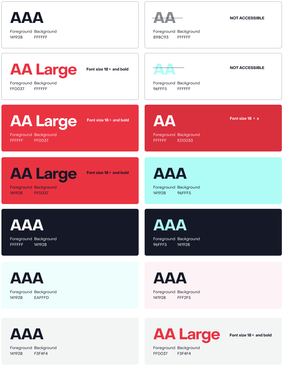
We established which colors can be used together. Even though these colors were given to us by an outside agency they were not yet tested for digital accessibility. In order to pass for accessibility we created a slightly darker red.
Preliminary components
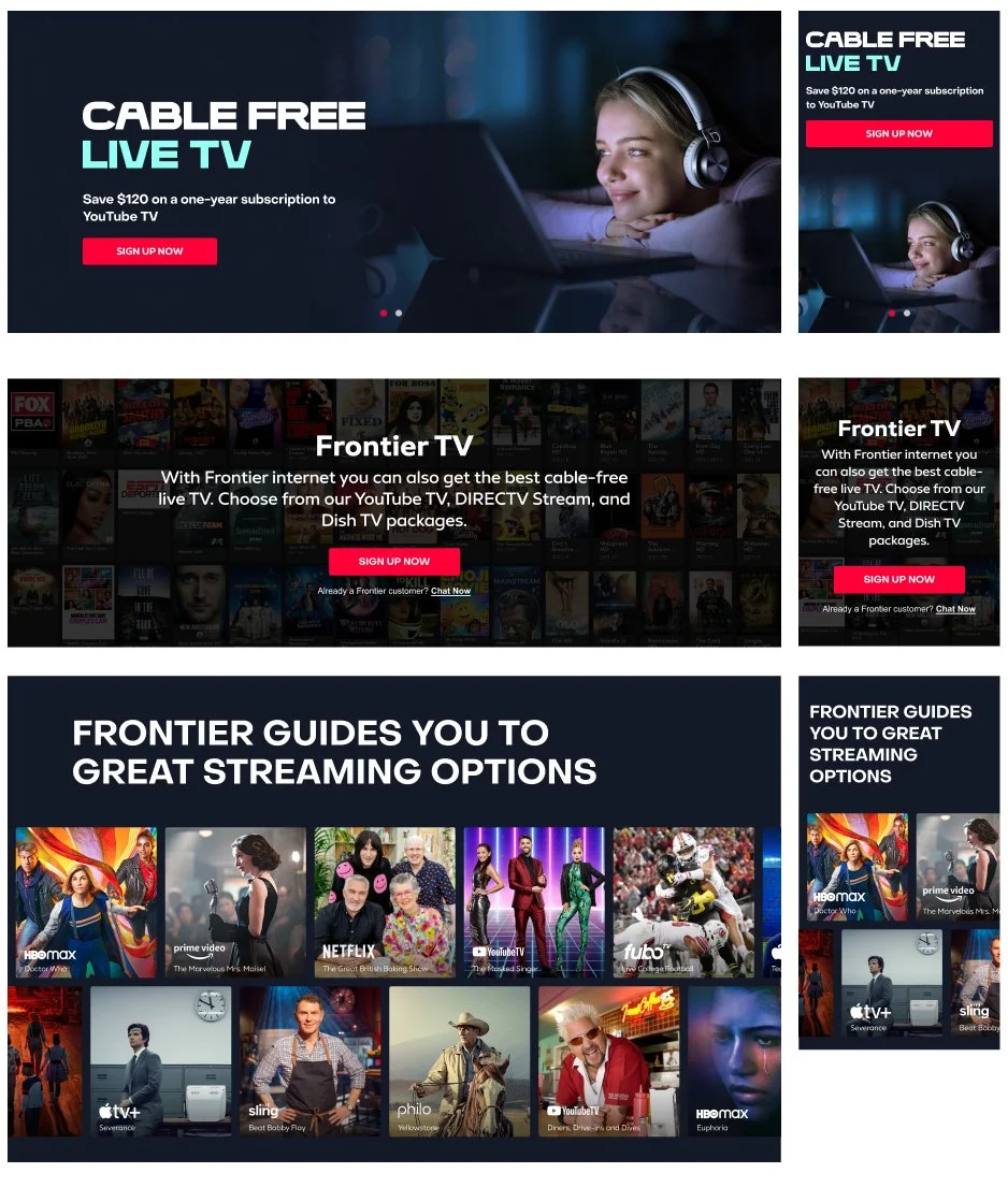
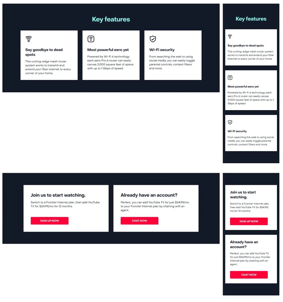
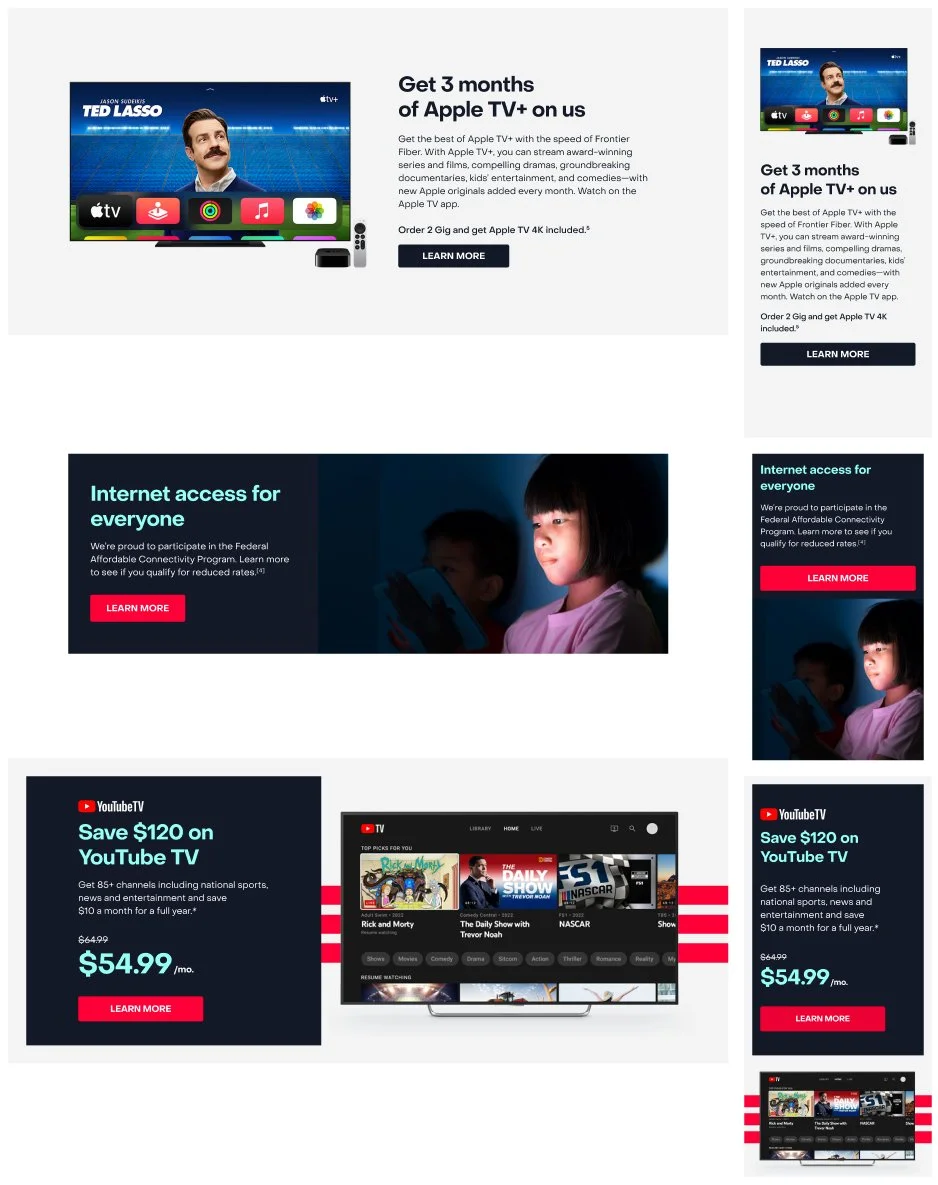
As I built components they were tested and used on the redesign of webpages. All components were built using atoms, so if any element needed to be changed it was easy to update the atom and then all other instances would be updated as well. Below is a sample of some preliminary components.
Hero components
Large and small examples
Text block components
Large and small examples
Media + text components
Large and small examples
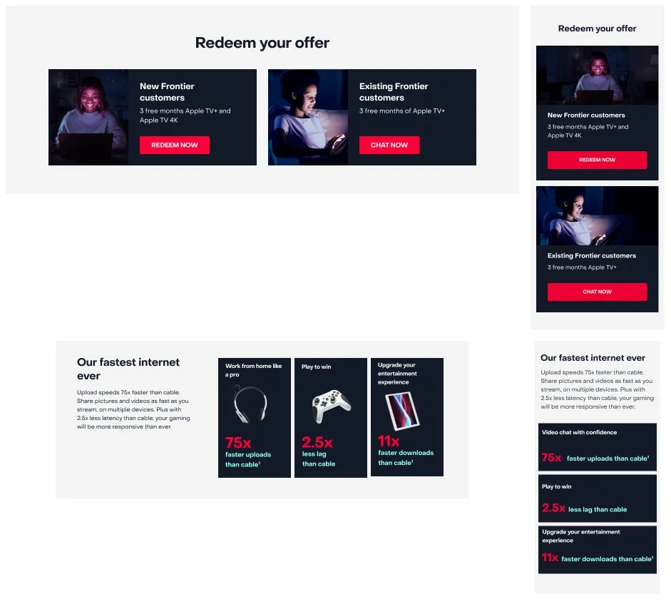
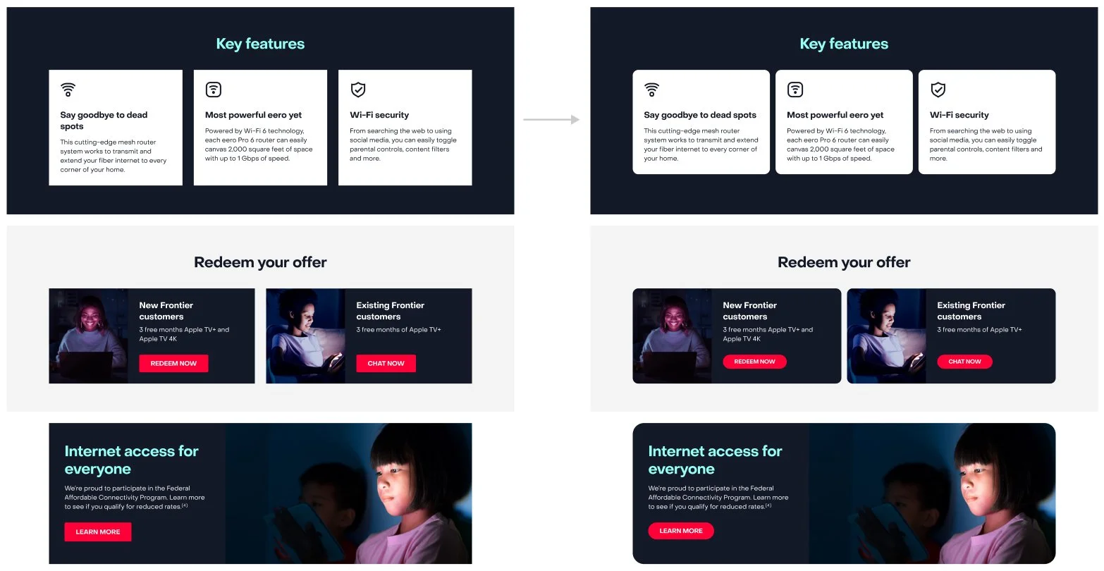
Updated styles and components
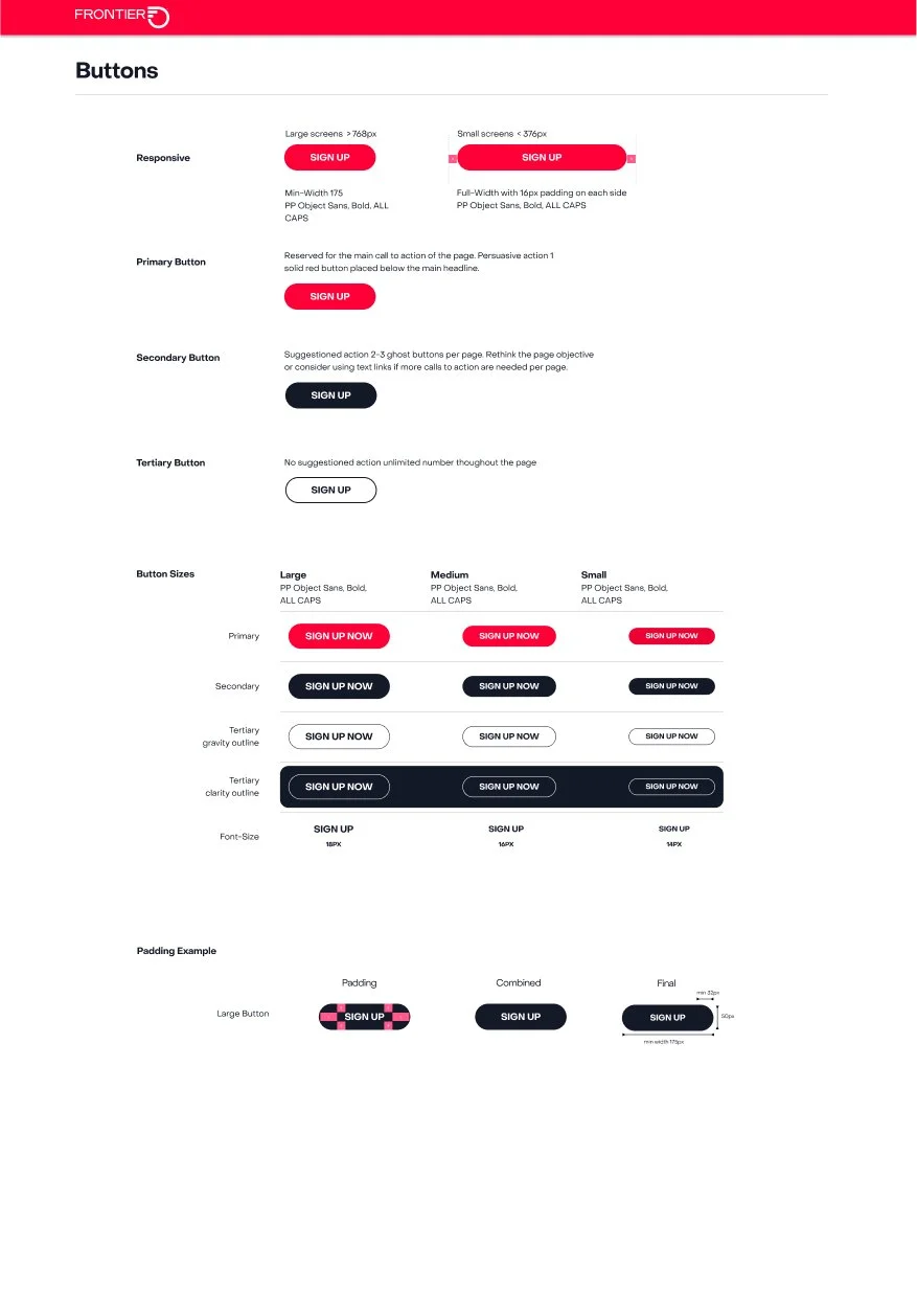
Through multiple rounds of user testing on different projects many updates were made to make the UI elements more modern, acccessible, and user friendly.
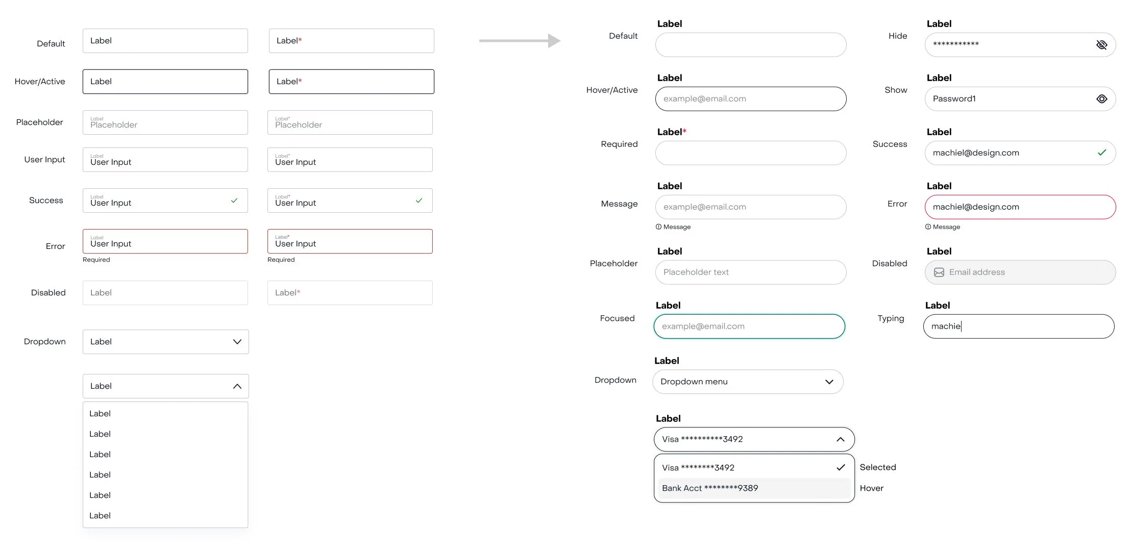
Text input fields
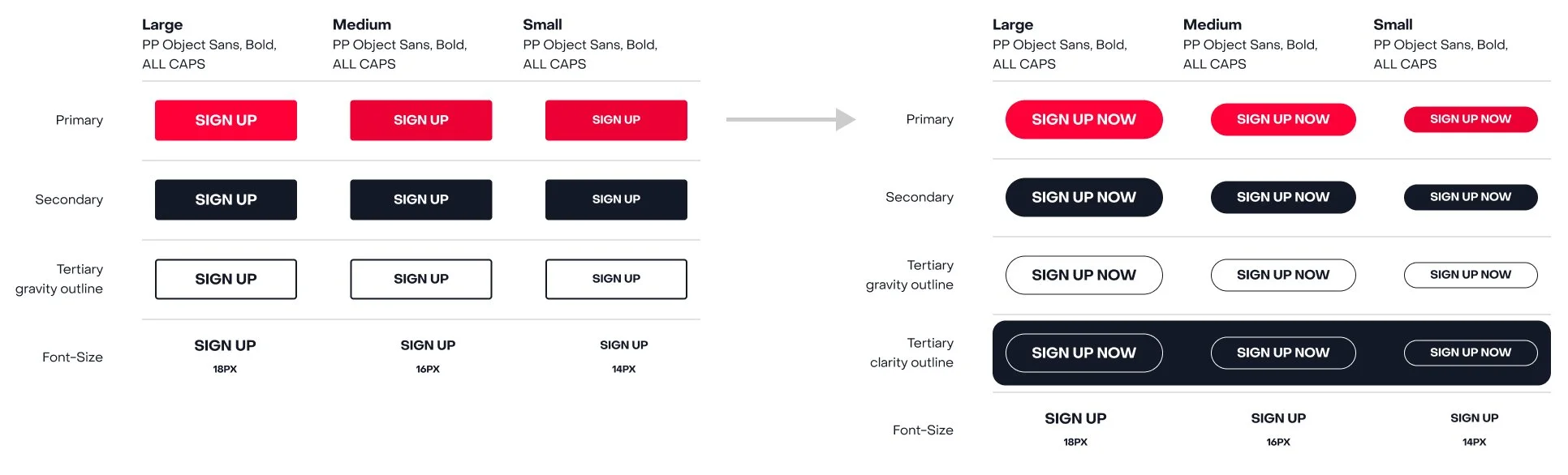
Buttons
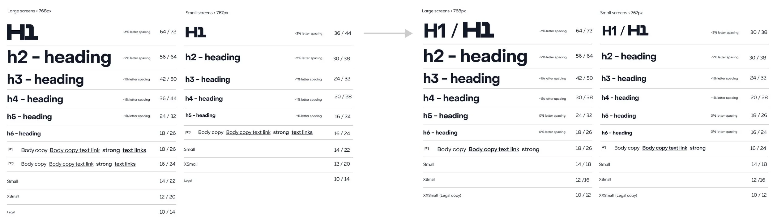
Text styles
Container properties
THE REDESIGN
Build trust while expanding
Frontier was not only changing its brand but also emerging from bankruptcy and expanding its business from previously focusing on older technologies, to now promoting higher-end products and bringing those products to as many areas of the country as possible. We must help individuals understand that Frontier is progressing as a company and reinventing itself.
Design system base
Component library
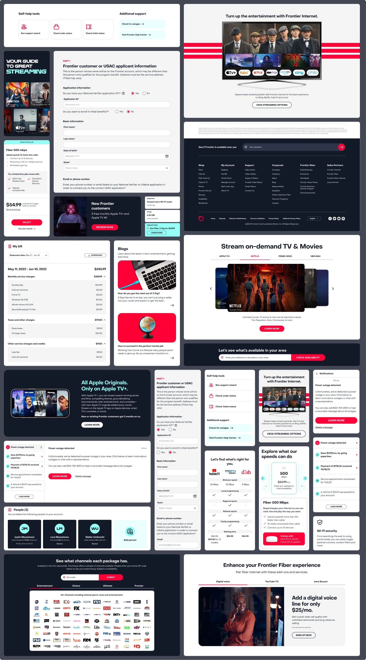
Using the atoms, I created molecules which were then used to create our components. Eventually, after the redesign of many web pages, an extensive component library was constructed. It is maintained in Figma and Storybook, and linked in Figma Make. Below are samples of some of the components I designed and tested.
Page templates
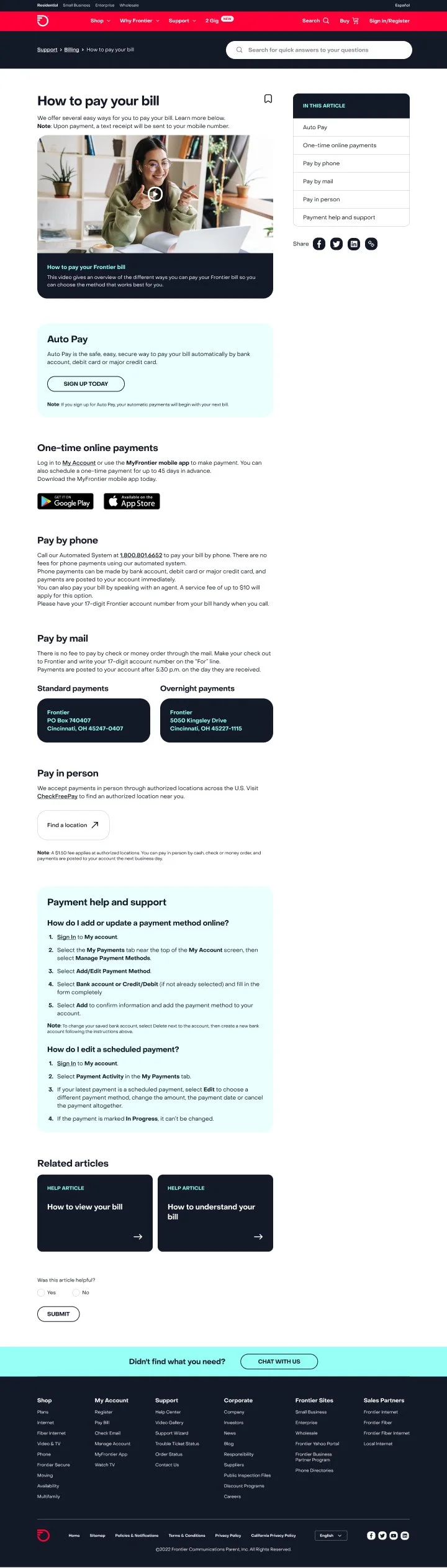
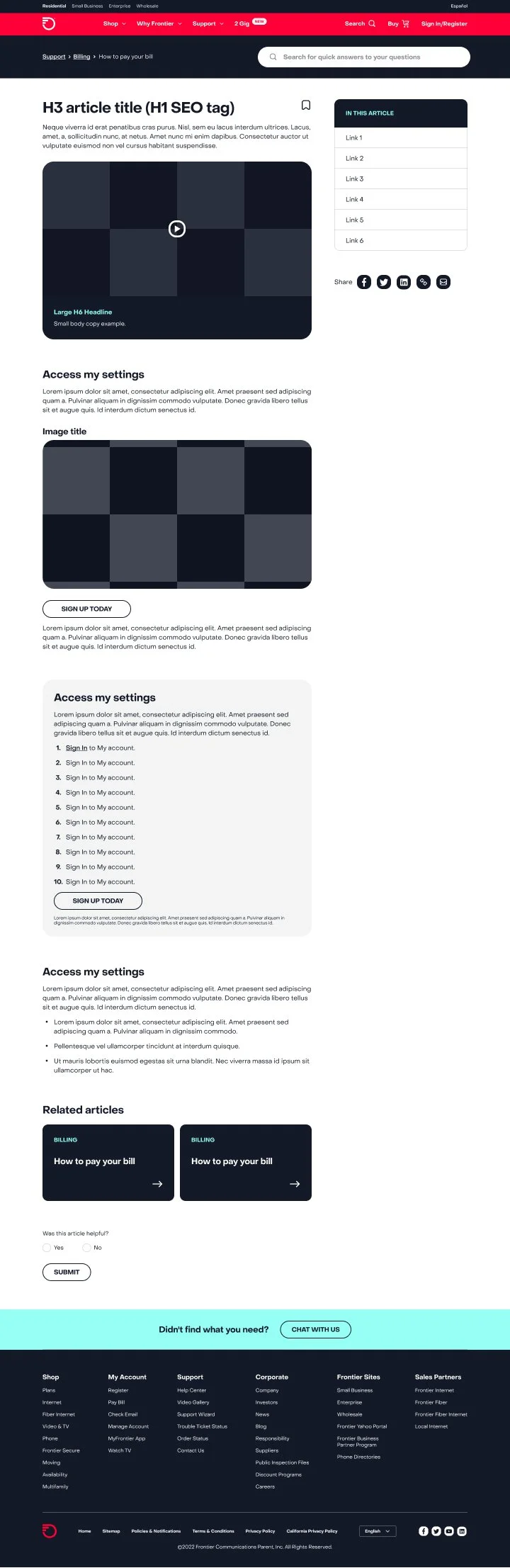
With our components, I created templates for some areas of the website. Below are two examples in the Help Center.
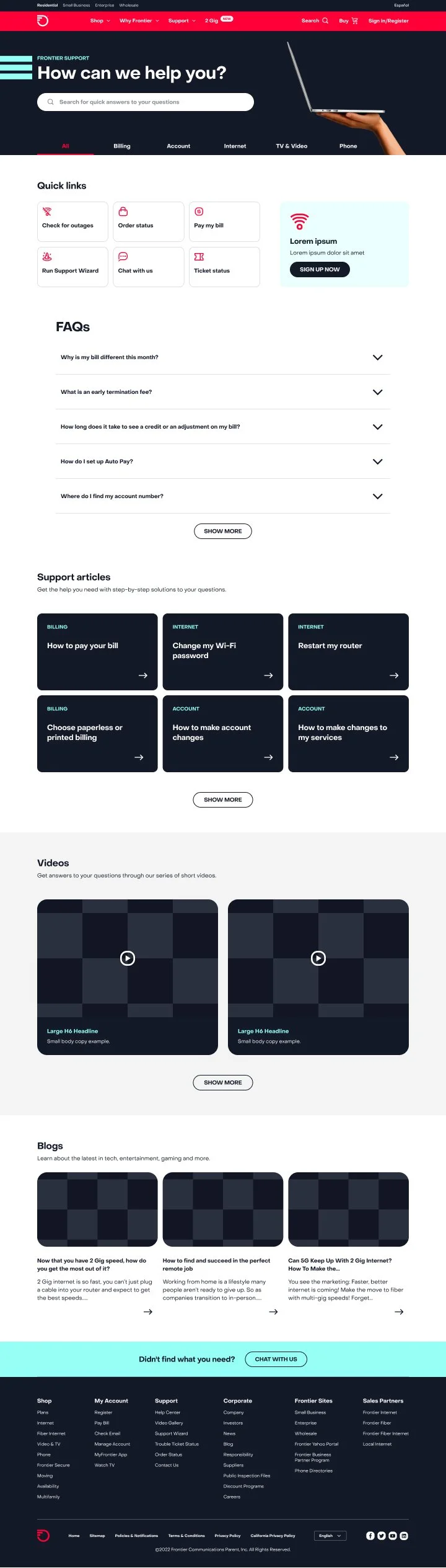
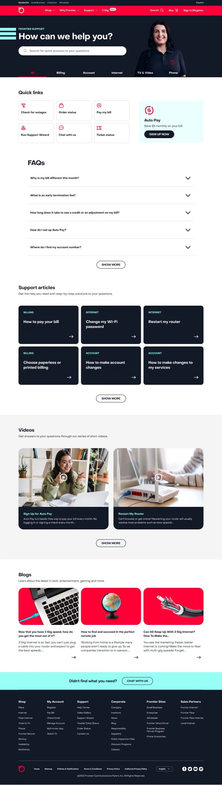
Help Center template in use
Help Center template
Help Center article template
Help Center article template in use
Pages updated with new components
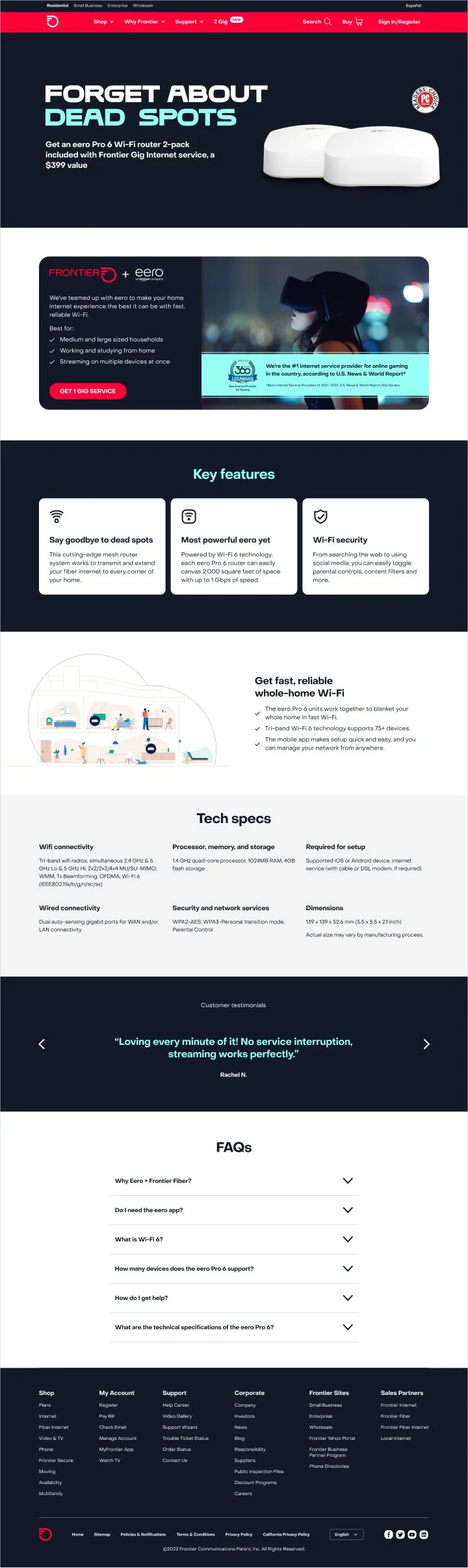
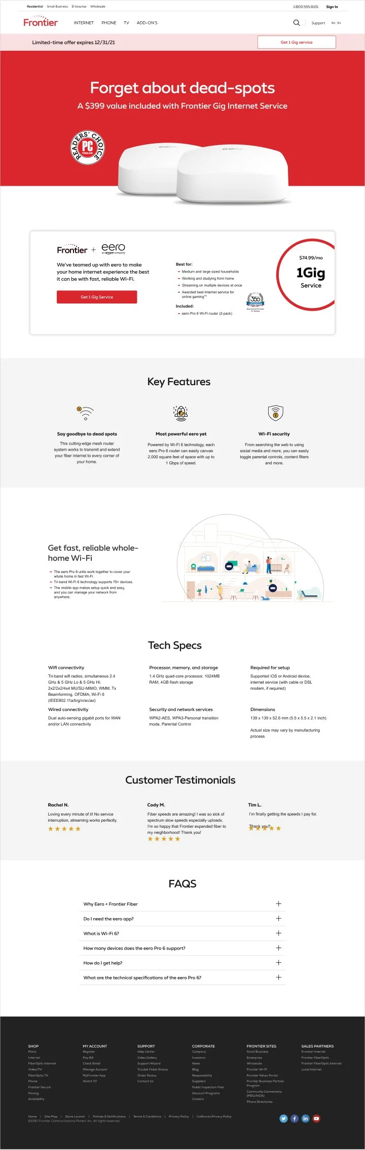
Across the website, pages that did not relate to templates were updated with new components. Below are a couple examples.
eero page before update
eero page after update
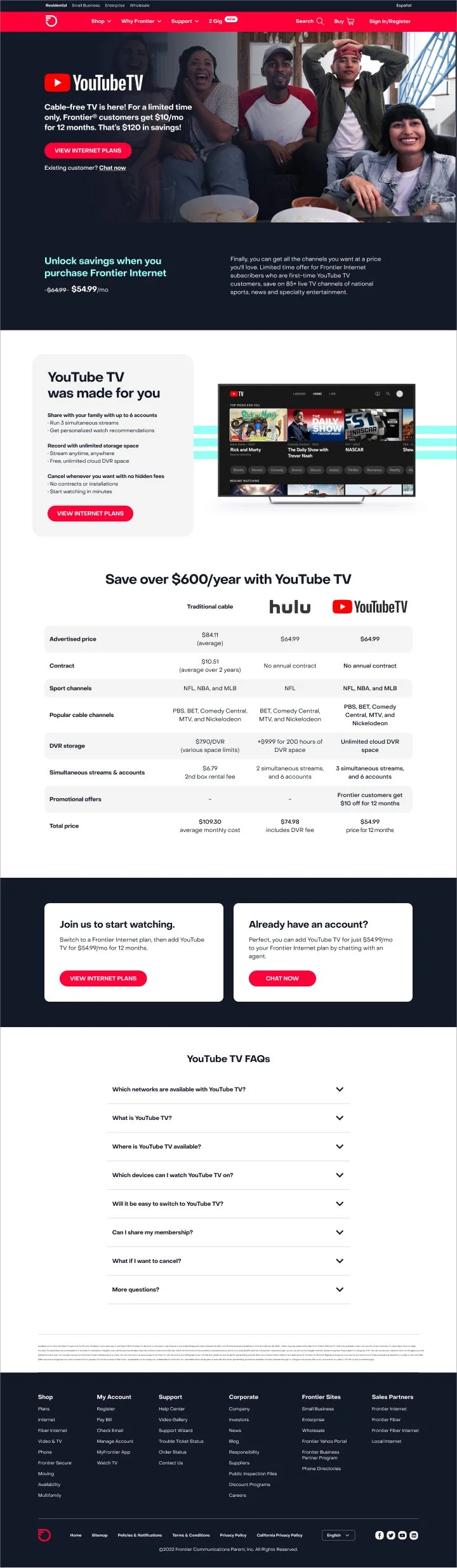
YouTube TV page after update
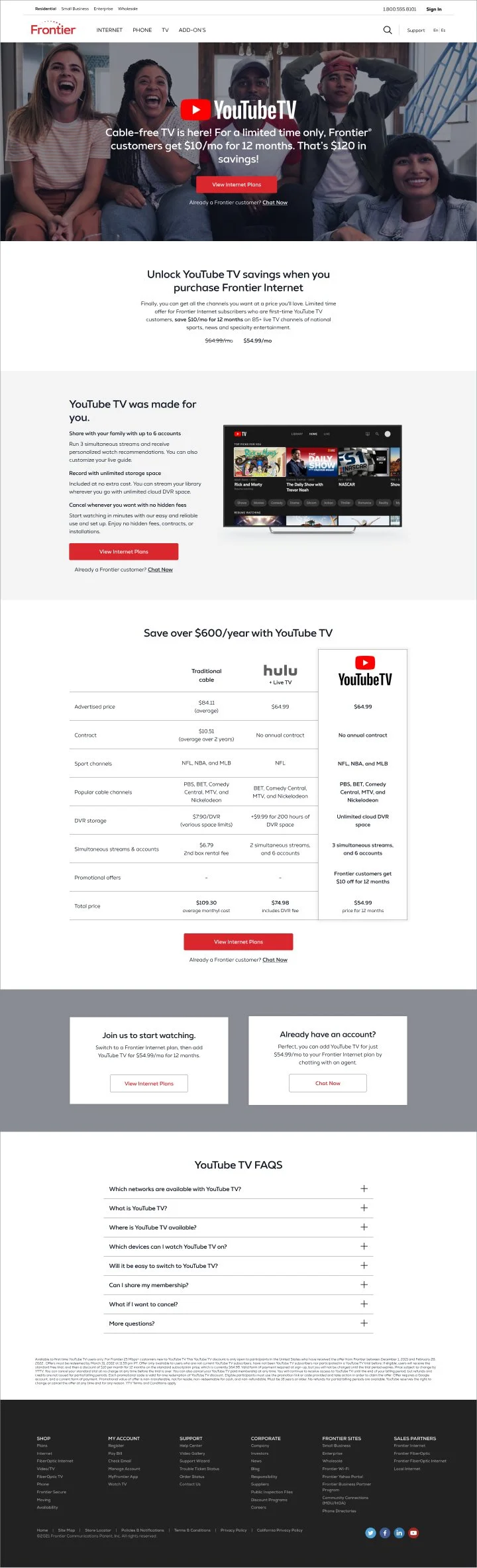
YouTube TV before update