

Account Management
OVERVIEW
Account management is Frontier’s logged-in customer experience across mobile app and web, giving customers access to their bills, payment methods, account settings, services, and other account details. Prior to this project, the experiences were outdated and inconsistent, which contributed to low monthly engagement. This project modernized the interface and reorganized the experience to make it more intuitive, efficient, and task-focused.
Client
Frontier
Scope
Redesign the entire account management experience across mobile app and web, modernizing the interface and re-architecting the platform to improve usability and task completion.
Results
As of Q3 2025 we increased monthly active users to 784K in the mobile app and 740K on the web, compared with 550K and 500K in the same quarter last year. The app’s store rating improved to 4.5 stars (from 4.2), and almost 2,000 customer calls related to account‑management issues were deflected this quarter.
PROBLEM
Low customer engagement with account management. Many customers would not return to their digital account after they set it up. The experience was frustrating; customers’ would be more likely to call in rather than to engage online.
1
Confusing experience made it unclear where and how to complete common tasks
2
Multiple bad reviews and poor rating in the Google Play and App Store
3
The experience was not aesthetically appealing which hurts customer trust in the brand
Current experience
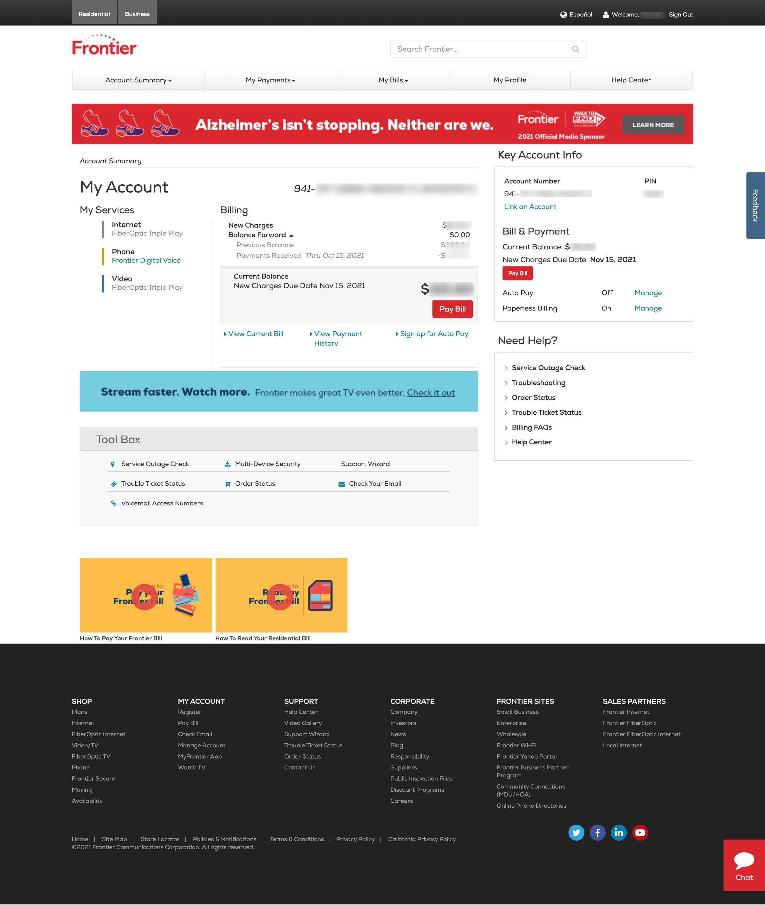
Account Dashboard
The current dashboard felt outdated, had hierarchy issues, conflicting messaging, reduntant information, and confusing links
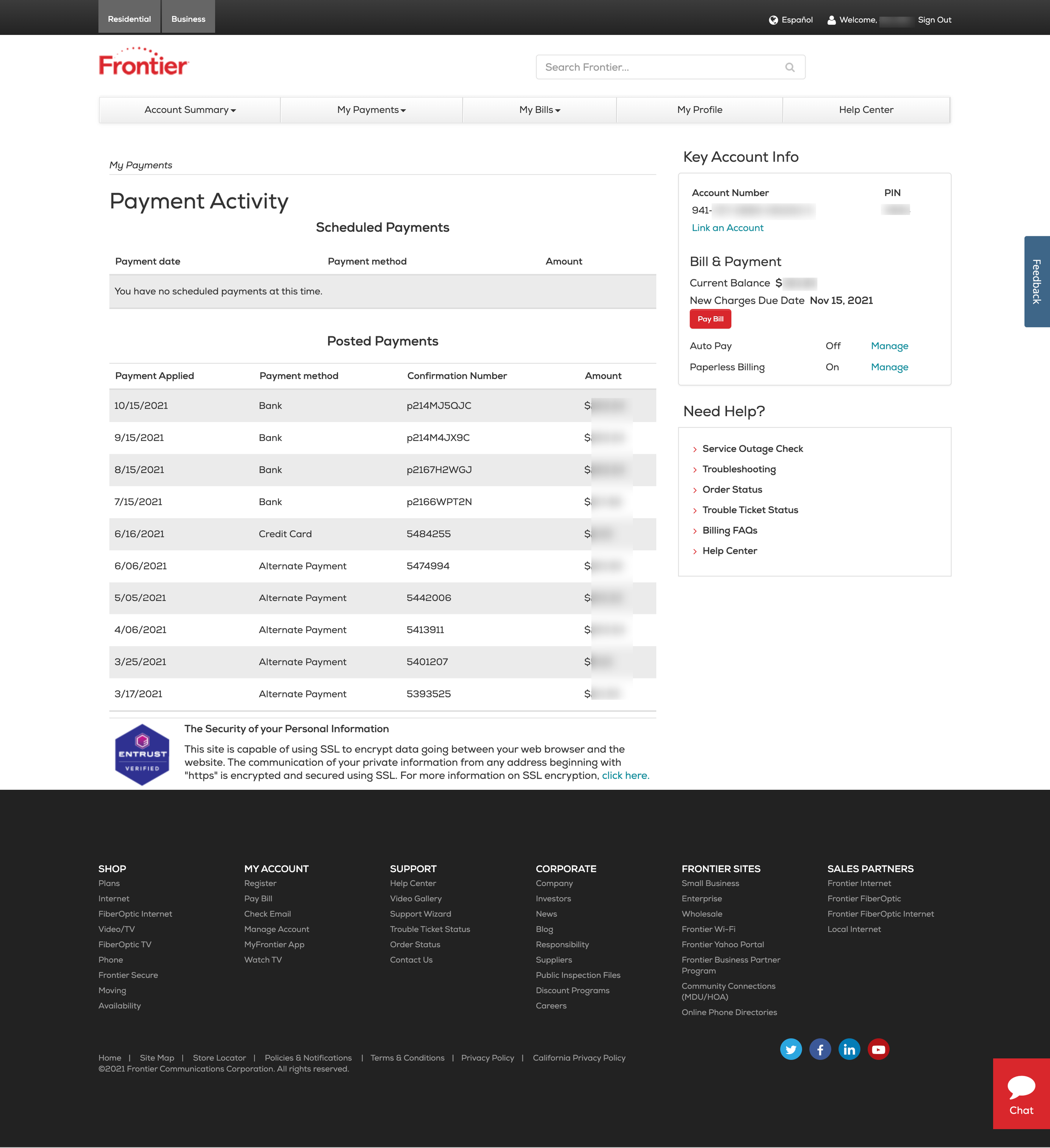
Payment Activity
Irrelevant information was displayed on this page, and contained no clear actions to take
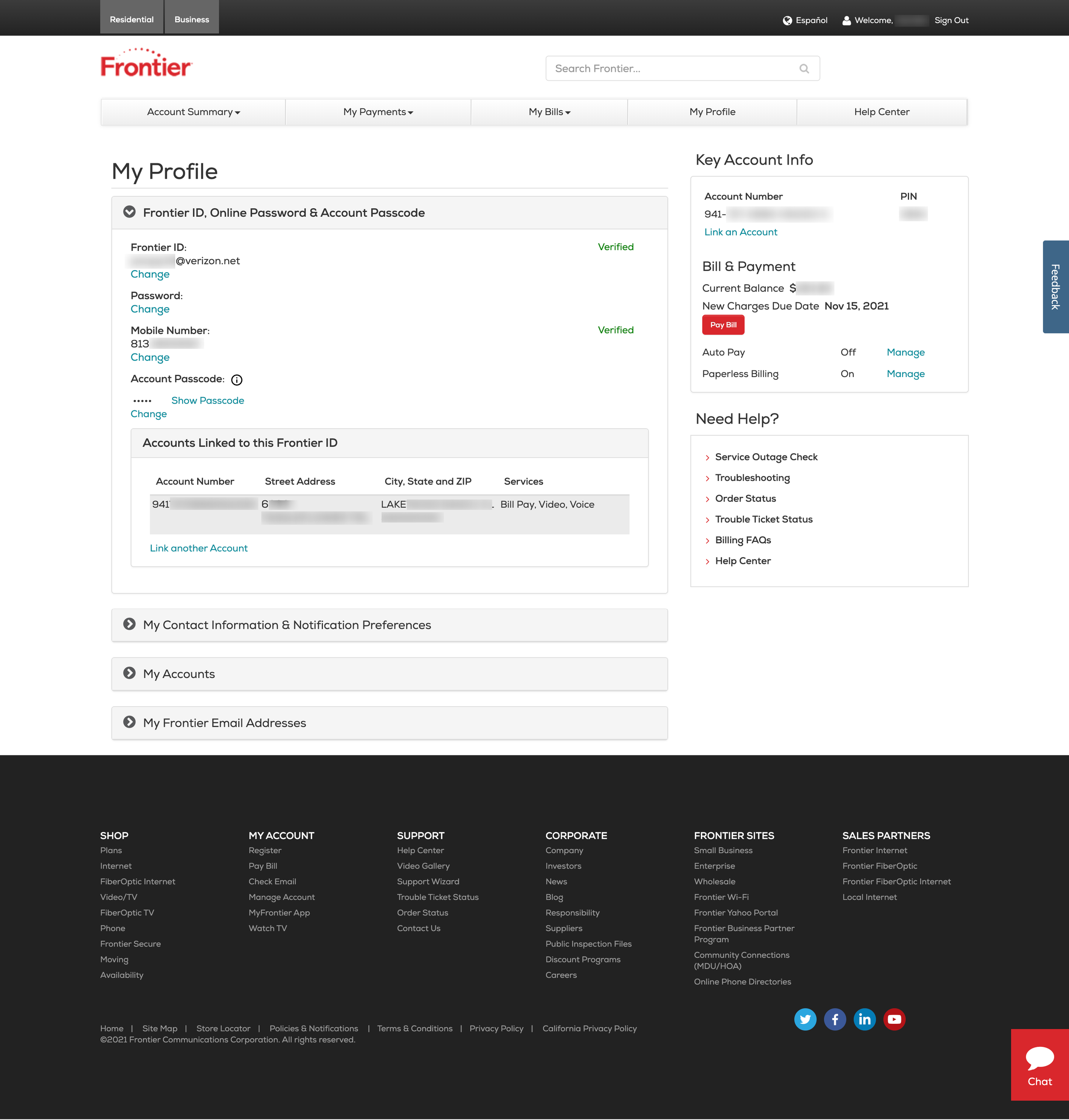
Profile
Important information was not displayed properly or easy to understand
THE APPROACH
Modernize each page while prioritizing key user tasks
Re-architect account management to make the completion of key tasks intuitive. Modernize and re-brand to provide customers with a clean account management experience.
Key tasks identified
Based on site click data and business needs, then ranked accordingly. All key tasks must be easily accessible from the customer’s dashboard.

Account Management architecture
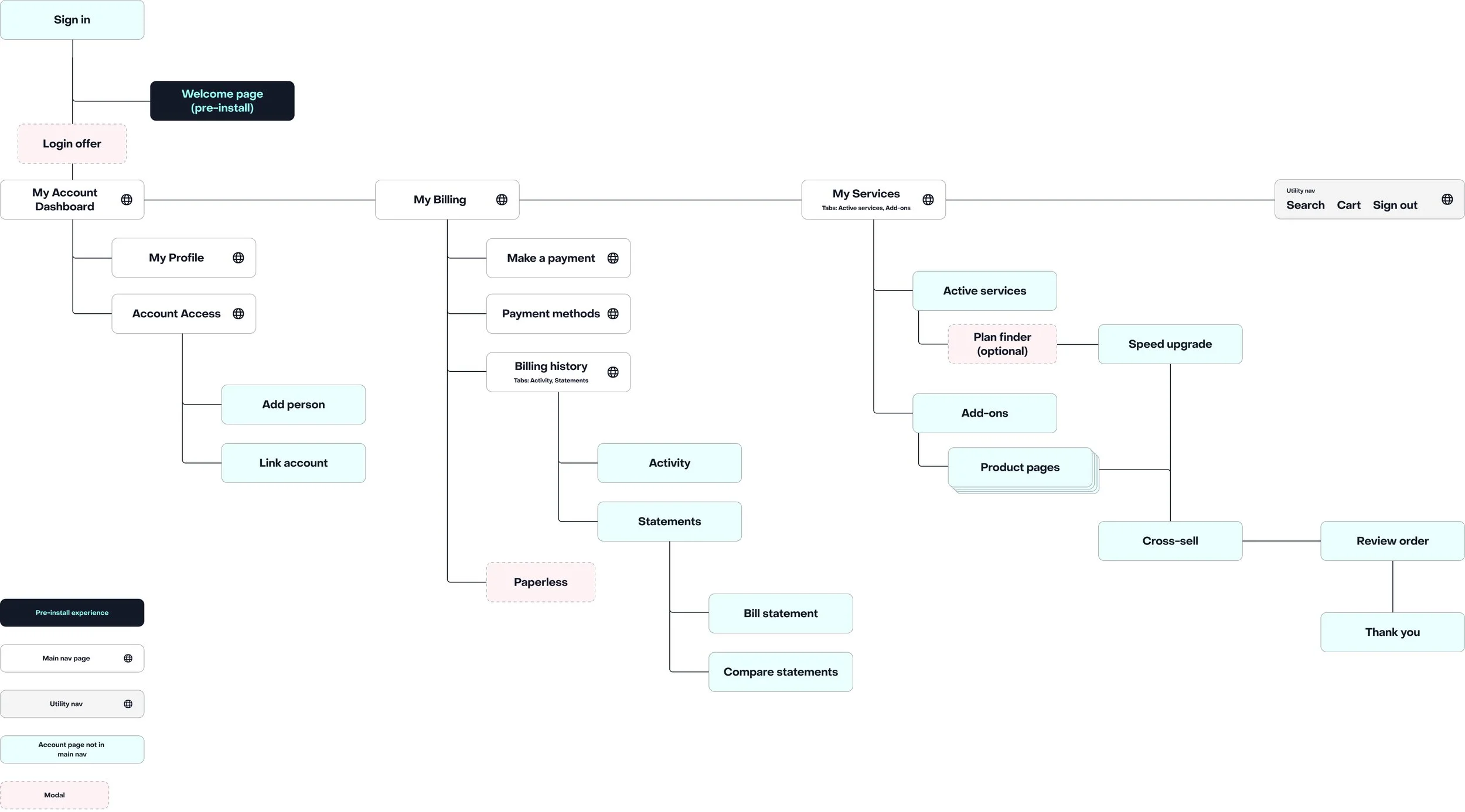
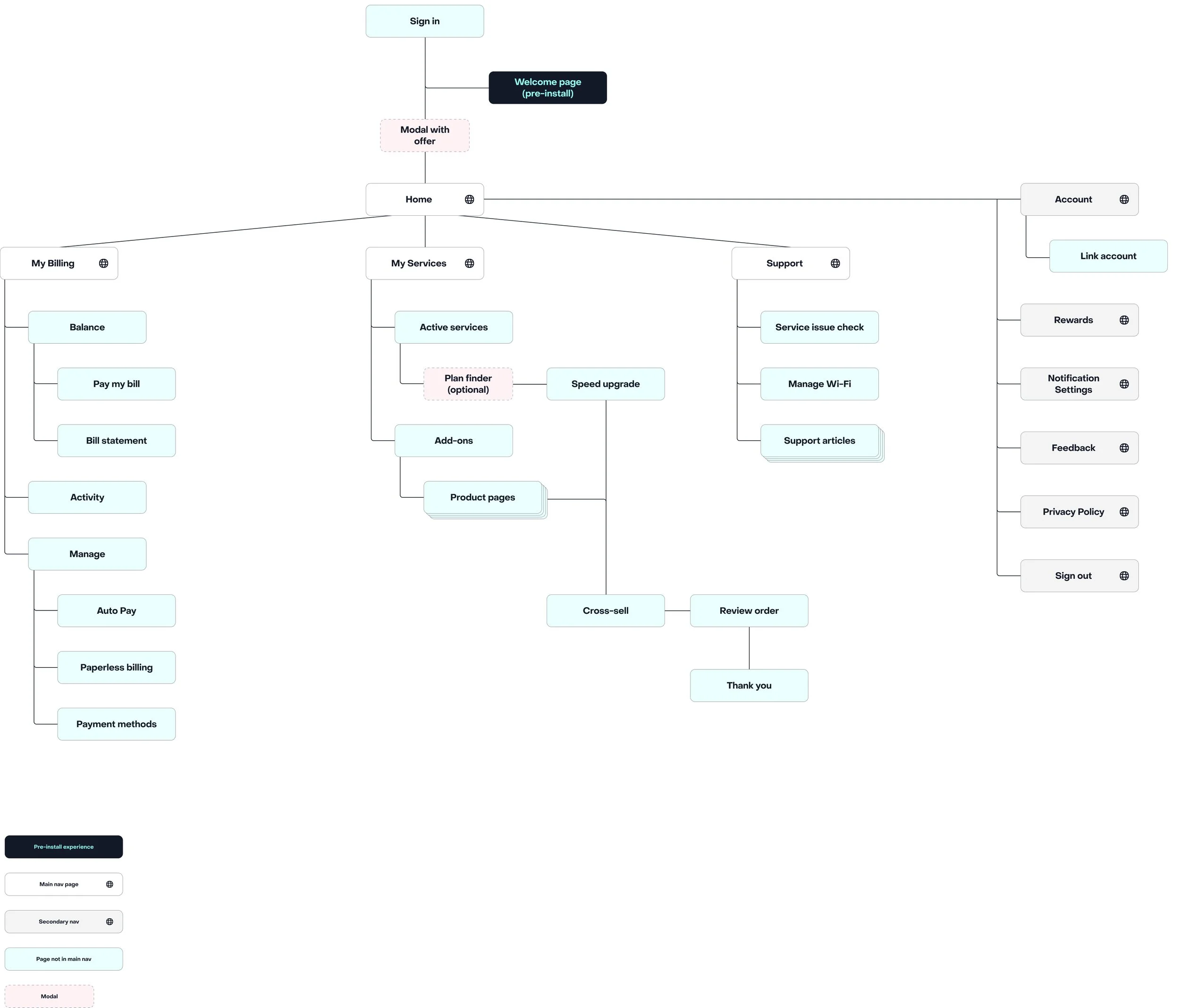
Sitemap for the web
Separated the account into three key areas that follows cognitive recognition
Sitemap for the app platform
The app sitemap contained some key differences from the website that were adjusted based on common app experiences, user testing results, and certain tasks only available in the app
UX Research
Through an iterative design process multiple rounds of user testing were performed. Below is a snapshot of a few of the user tests conducted on key pages, which were subsequently adjusted based on the user testing feedback
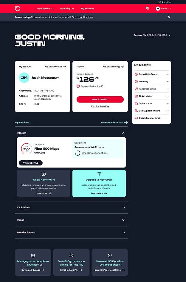
Dashboard
Users rely on quick links and navigation to find support.
Users expected personalized copy, such as “Go to My Profile”.
Users expected a payment CTA.
Users stated the blue upgrade card stands out more than the rest of the page.
Overall, users easily and quickly identified the top four tasks.
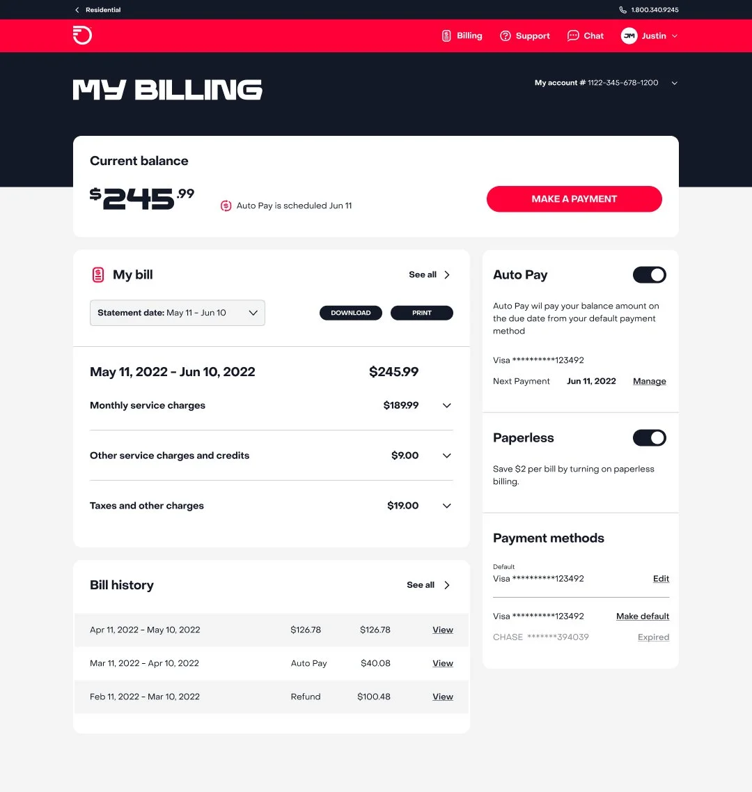
Main billing page
Confused about the difference of "my bill" and "statements".
Expressed a desire for notification alerts about changes in their bill.
The billing user flows are missing supportive language at multiple stages. Need personalized resources rather than the articles and videos.
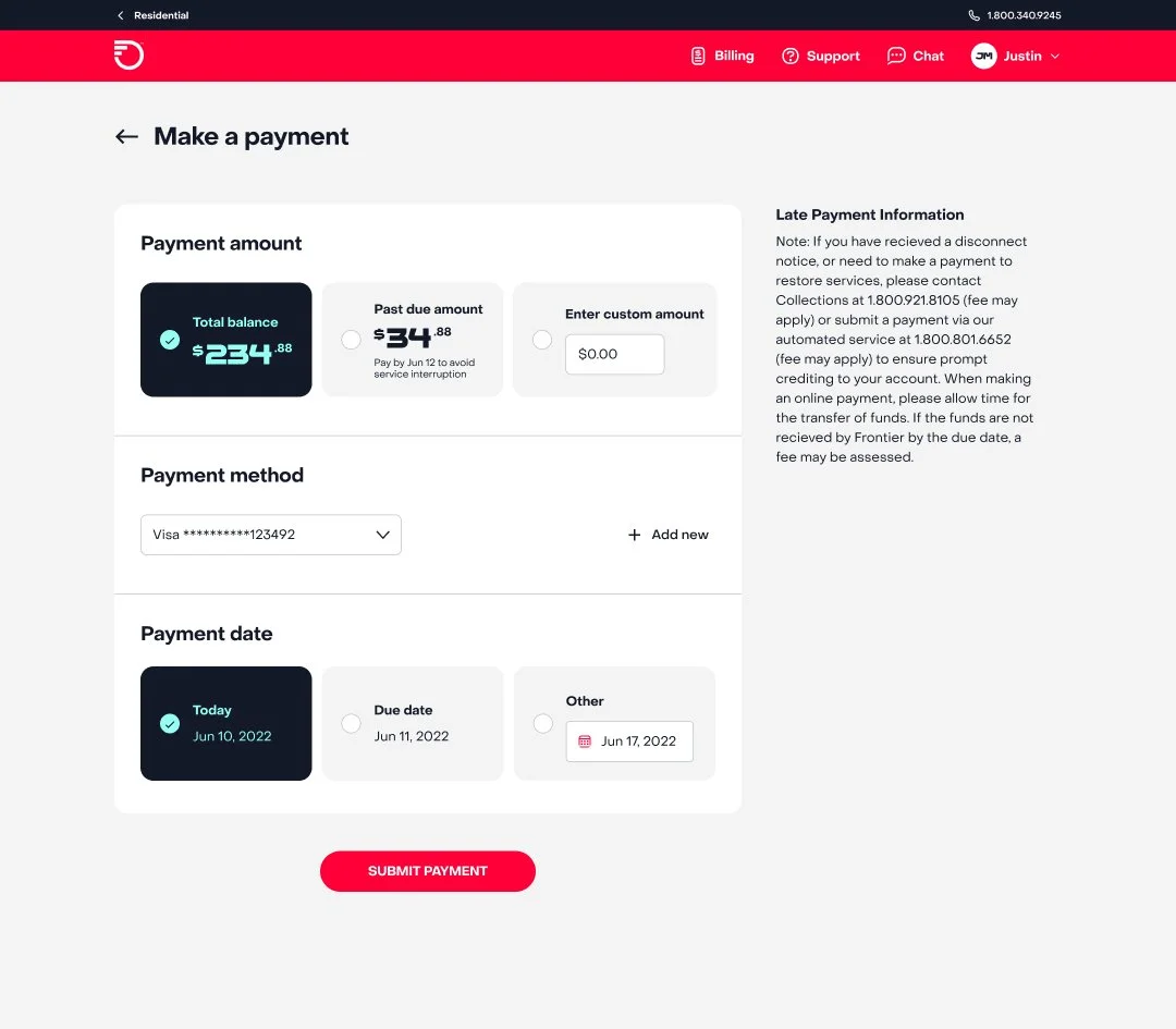
Make a payment
100% task success rate.
Users need to know where they can find more information about their past due amount.
Users like breadcrumbs to navigate back and forth from pages. This increased user frustration.
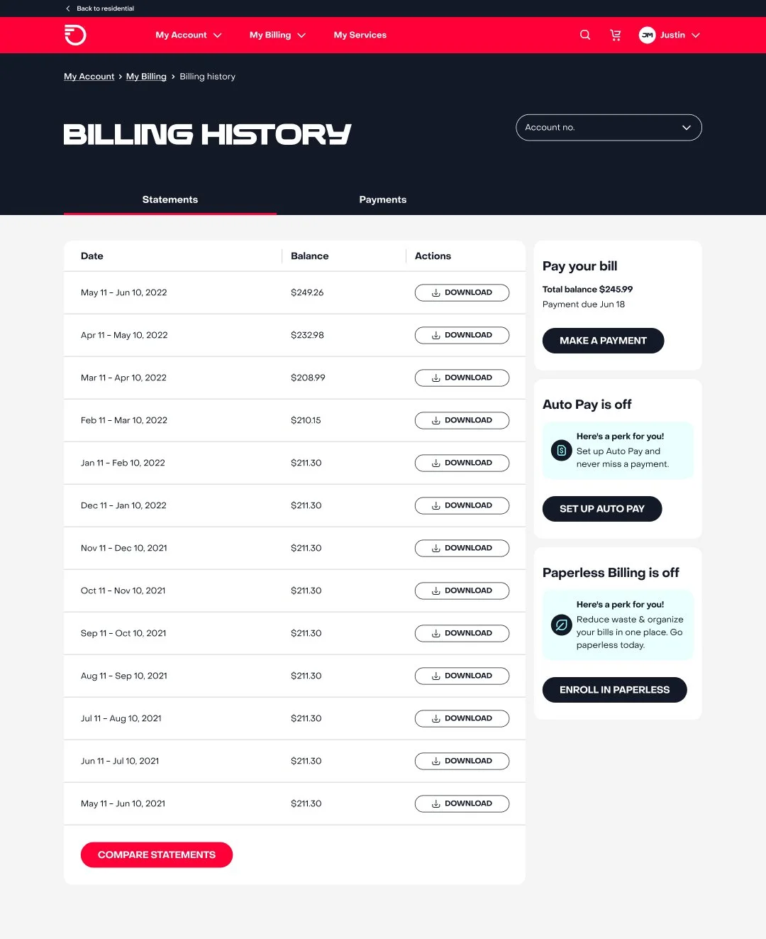
Billing history
Users found it difficult to compare bills due to labeling and visual design.
Users desired more detailed information about history, such as, amount due, payments, and statements integrated into one view.
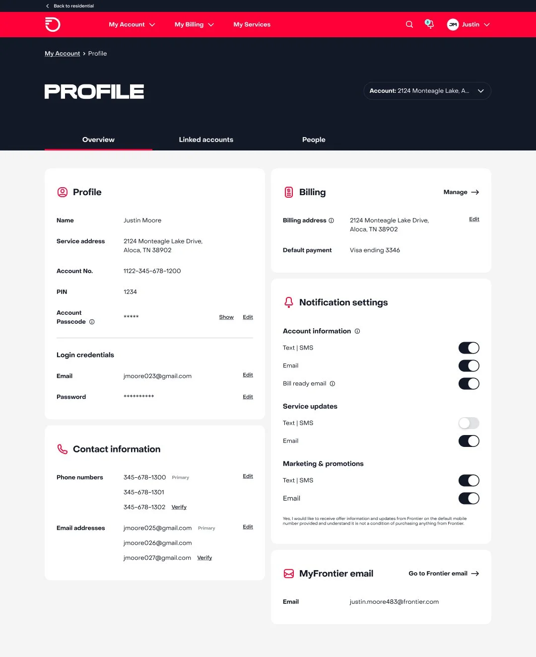
Customer profile
Users stated toggle feature stands out the most on this page.
Overall, users easily and quickly identified at least one task from each card.
Mobile app UX Research
Both moderated and unmoderated user tests were performed on the app. Below are some insights on key app pages, which were subsequently adjusted based on the user testing feedback
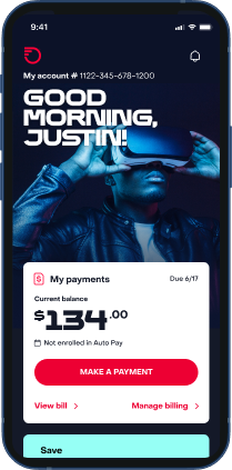
Dashboard
Imagery felt distracting and outdated.
Users expressed need to know how to enhance their accounts.
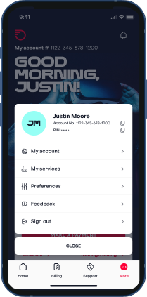
App menu
Make it easier to view current services in plan
Users were unsure why account number and PIN were in the menu
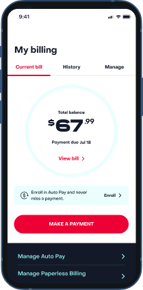
Current bill
Circle graphic did not provide a use
Users wanted to see recent activity on their account
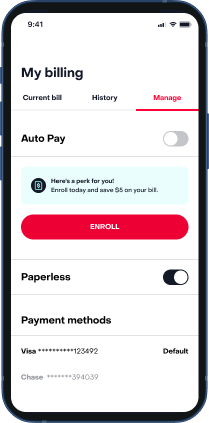
Manage billing
The use of a button and toggle felt redundant
Should provide more information about paperless
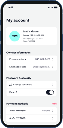
Account info
Users understood purpose of each container
THE REDESIGN
Create a modern account management experience
Make it easy for existing customers to manage their accounts so they want to log in and complete tasks online